Dashboards
Build interactive dashboards combining charts, pivot tables, data tables, and reports into unified views.
Table of Contents
- Everything You Need Is Already Here
- Example: Get a Dashboard in 5 Minutes
- The Building Blocks
- Atomic Values (rb-value)
- Supported Databases
- Next: Make It Fast
Everything You Need Is Already Here
You have the data. You have the data warehouse — DuckDB for fast embedded analytics, ClickHouse for enterprise scale. You have powerful OLAP engines that handle everything from 100 rows to 10 billion. You have data-driven web components — pivot tables, charts, data grids, and parameterized reports — ready to drop into any page.
So what would stop you from building the best BI dashboards in the world?
Nothing. Absolutely nothing.
Note: Below you will see various code snippets — scripts, HTML templates, component configurations. None of this code needs to be written by hand. ReportBurster's built-in AI tools generate everything for you. Just click the "Hey AI, Help Me with..." buttons and describe what you need.
Example: Get a Dashboard in 5 Minutes
Can you get this dashboard done in 5 minutes? Let's see...
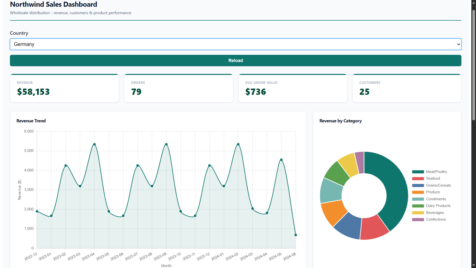
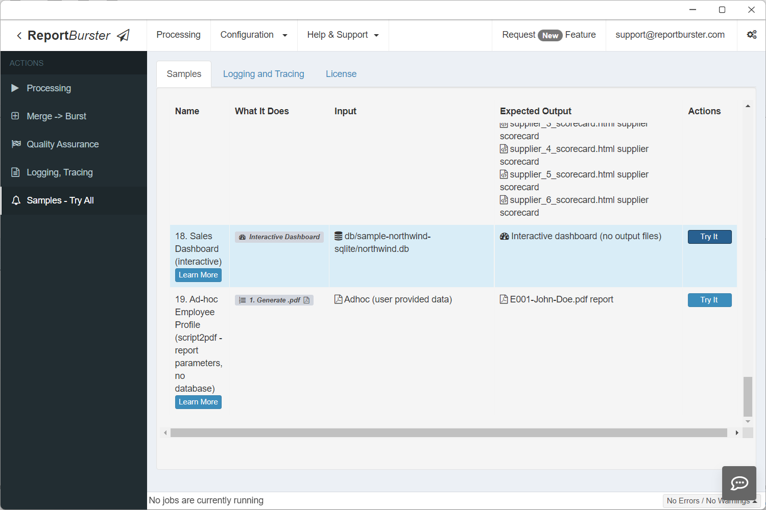
Want to see it before you build it? This exact dashboard ships as a built-in sample. Go to Samples — Try All and click Try It on the Sales Dashboard entry to open the live, working dashboard instantly — no configuration needed.
Follow these steps to build a working Northwind Sales Dashboard — complete with KPI cards, charts, a data table, a pivot table, and a country filter. We'll use pre-canned configuration so you can focus on learning the workflow.
Note: The Northwind SQLite database already ships with ReportBurster and contains all the data needed for this tutorial. To get the dashboard up and running as fast as possible, simply copy each code snippet below into the corresponding tab — get your dashboard ready in 5 minutes (and, along the way, learn how to do it for yourself).
When building your own dashboards over your own data, you'd use the AI tools built into ReportBurster to generate all the code. We'll show you exactly where those buttons are at each step.
Step 1: Configure the Database Connection
The sample Northwind SQLite database is included with ReportBurster — no Docker or external setup needed. Go to Configuration → Connections (Email, Databases) and configure your connection.
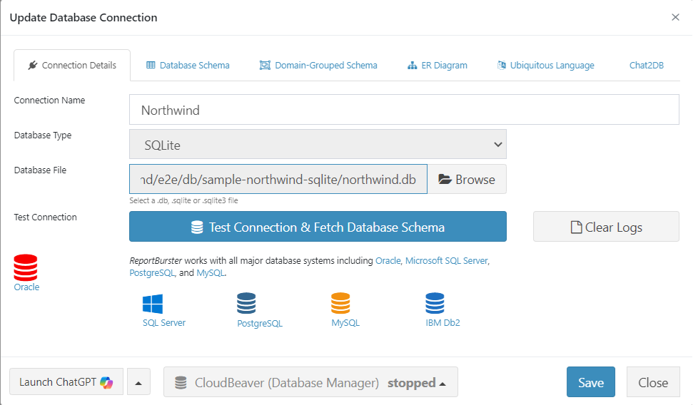
Click Test Connection & Fetch Database Schema. ReportBurster validates your connection and retrieves the complete database schema.

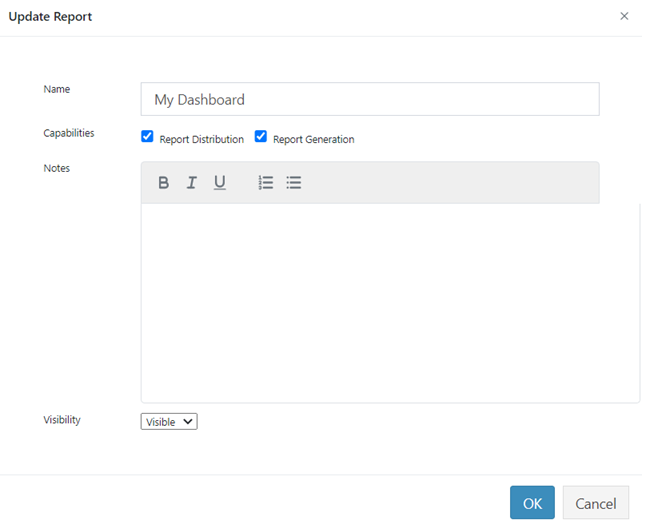
Step 2: Create the Report
Step 3: The Datasource
On the DataSource tab, set the Input Type to Script (for fetching dashboard data) and select the database connection you created in Step 1 (e.g., Northwind (default)) from the Database Connection dropdown.
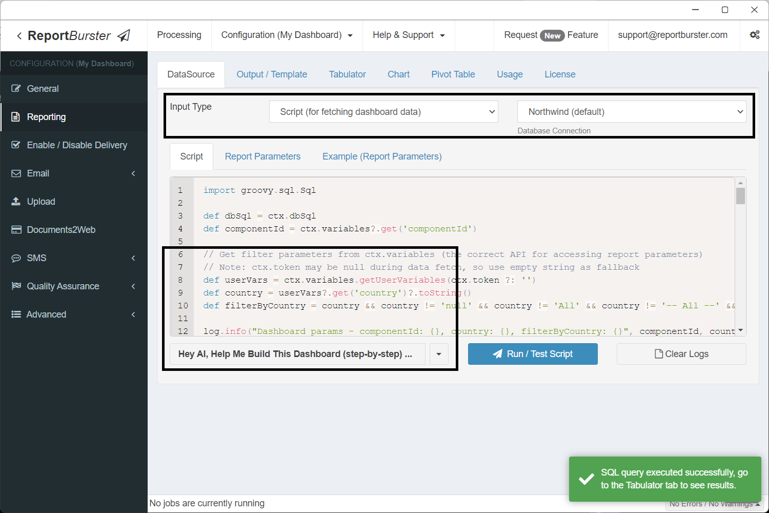
In practice you'd let the built-in AI write this script for you. For now, grab the ready-made script below so we can jump straight to the dashboard.
import groovy.sql.Sql

def dbSql = ctx.dbSql
def componentId = ctx.variables?.get('componentId')

// Get filter parameters from ctx.variables (the correct API for accessing report parameters)
// Note: ctx.token may be null during data fetch, so use empty string as fallback
def userVars = ctx.variables.getUserVariables(ctx.token ?: '')
def country = userVars?.get('country')?.toString()
def filterByCountry = country && country != 'null' && country != 'All' && country != '-- All --' && country.trim() != ''

log.info("Dashboard params - componentId: {}, country: {}, filterByCountry: {}", componentId, country, filterByCountry)

// KPI base query (shared WHERE clause)
def kpiBase = """
    FROM Orders o
    JOIN "Order Details" od ON o.OrderID = od.OrderID
"""
if (filterByCountry) kpiBase += " WHERE o.ShipCountry = '${country}'"

// Component: atomicValues — single query returning all 4 KPI values as columns
if (!componentId || componentId == 'atomicValues') {
    def data = dbSql.rows("""
        SELECT
            ROUND(SUM(od.UnitPrice * od.Quantity * (1 - od.Discount)), 0) AS revenue,
            COUNT(DISTINCT o.OrderID) AS orders,
            ROUND(SUM(od.UnitPrice * od.Quantity * (1 - od.Discount)) / COUNT(DISTINCT o.OrderID), 0) AS avgOrderValue,
            COUNT(DISTINCT o.CustomerID) AS customers
    """ + kpiBase)
    ctx.reportData('atomicValues', data)
}

// Component: revenueTrend (Chart — monthly revenue)
if (!componentId || componentId == 'revenueTrend') {
    def sql = """
        SELECT
            STRFTIME('%Y-%m', o.OrderDate / 1000, 'unixepoch') AS month,
            ROUND(SUM(od.UnitPrice * od.Quantity * (1 - od.Discount)), 0) AS revenue
        FROM Orders o
        JOIN "Order Details" od ON o.OrderID = od.OrderID
        WHERE o.OrderDate IS NOT NULL
    """
    if (filterByCountry) sql += " AND o.ShipCountry = '${country}'"
    sql += " GROUP BY STRFTIME('%Y-%m', o.OrderDate / 1000, 'unixepoch') ORDER BY month"
    def data = dbSql.rows(sql)
    ctx.reportData('revenueTrend', data)
}

// Component: revenueByCategory (Chart — revenue per product category)
if (!componentId || componentId == 'revenueByCategory') {
    def sql = """
        SELECT
            c.CategoryName AS category,
            ROUND(SUM(od.UnitPrice * od.Quantity * (1 - od.Discount)), 0) AS revenue
        FROM "Order Details" od
        JOIN Products p ON od.ProductID = p.ProductID
        JOIN Categories c ON p.CategoryID = c.CategoryID
        JOIN Orders o ON od.OrderID = o.OrderID
    """
    if (filterByCountry) sql += " WHERE o.ShipCountry = '${country}'"
    sql += " GROUP BY c.CategoryName ORDER BY revenue DESC"
    def data = dbSql.rows(sql)
    ctx.reportData('revenueByCategory', data)
}

// Component: topCustomers (Tabulator — top 10 by revenue)
if (!componentId || componentId == 'topCustomers') {
    def sql = """
        SELECT
            cu.CompanyName AS company,
            cu.Country AS country,
            cu.ContactName AS contact,
            COUNT(DISTINCT o.OrderID) AS orders,
            ROUND(SUM(od.UnitPrice * od.Quantity * (1 - od.Discount)), 2) AS revenue
        FROM Customers cu
        JOIN Orders o ON cu.CustomerID = o.CustomerID
        JOIN "Order Details" od ON o.OrderID = od.OrderID
    """
    if (filterByCountry) sql += " WHERE o.ShipCountry = '${country}'"
    sql += " GROUP BY cu.CustomerID, cu.CompanyName, cu.Country, cu.ContactName ORDER BY revenue DESC LIMIT 10"
    def data = dbSql.rows(sql)
    ctx.reportData('topCustomers', data)
}

// Component: orderExplorer (Pivot Table — orders by country, category, year)
if (!componentId || componentId == 'orderExplorer') {
    def sql = """
        SELECT
            o.ShipCountry AS country,
            c.CategoryName AS category,
            STRFTIME('%Y', o.OrderDate / 1000, 'unixepoch') AS year,
            ROUND(SUM(od.UnitPrice * od.Quantity * (1 - od.Discount)), 2) AS revenue,
            SUM(od.Quantity) AS quantity
        FROM Orders o
        JOIN "Order Details" od ON o.OrderID = od.OrderID
        JOIN Products p ON od.ProductID = p.ProductID
        JOIN Categories c ON p.CategoryID = c.CategoryID
        WHERE o.OrderDate IS NOT NULL
    """
    if (filterByCountry) sql += " AND o.ShipCountry = '${country}'"
    sql += " GROUP BY o.ShipCountry, c.CategoryName, STRFTIME('%Y', o.OrderDate / 1000, 'unixepoch') ORDER BY country, category, year"
    def data = dbSql.rows(sql)
    ctx.reportData('orderExplorer', data)
}This script fetches data for 5 dashboard components:
| Component ID | Type | What it returns |
|---|---|---|
atomicValues | rb-value (KPIs) | Revenue, orders, avg order value, customers — as columns in one row |
revenueTrend | rb-chart | Monthly revenue for a line chart |
revenueByCategory | rb-chart | Revenue per product category for a doughnut chart |
topCustomers | rb-tabulator | Top 10 customers by revenue |
orderExplorer | rb-pivot-table | Revenue by country, category, and year |
Each block is guarded by if (!componentId || componentId == '...') — so when a single component refreshes (e.g., after a parameter change), only its query runs.
Step 4: Parameters
This adds a Country dropdown filter to the dashboard. The dropdown options are populated dynamically from the database. When the user selects a country, all dashboard components automatically refresh with filtered data.
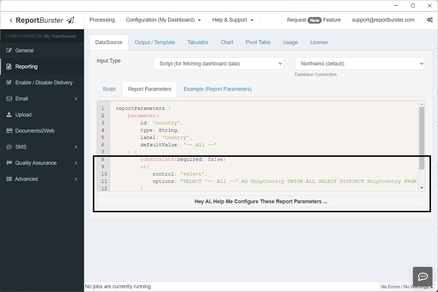
reportParameters {
    parameter(
        id: 'country',
        type: String,
        label: 'Country',
        defaultValue: '-- All --'
    ) {
        constraints(required: false)
        ui(
            control: 'select',
            options: "SELECT '-- All --' AS ShipCountry UNION ALL SELECT DISTINCT ShipCountry FROM Orders WHERE ShipCountry IS NOT NULL ORDER BY ShipCountry"
        )
    }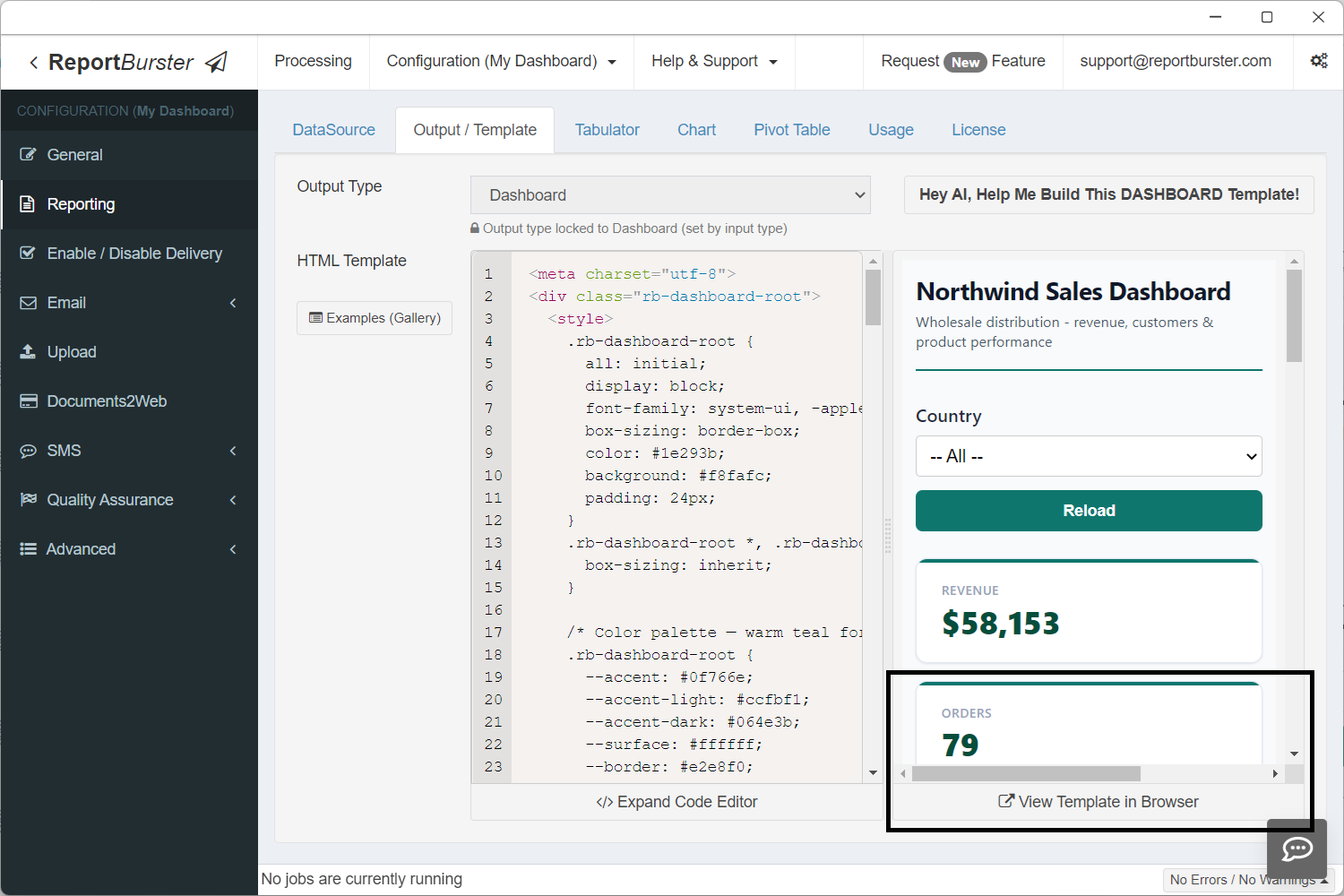
}Step 5: The Dashboard Template
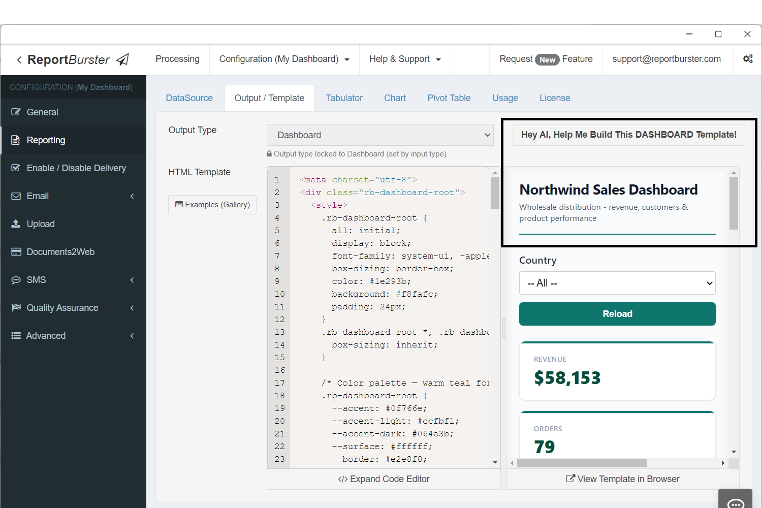
Same idea here — the AI can generate this template, but we already have one ready:
<meta charset="utf-8">
<div class="rb-dashboard-root">
<style>
.rb-dashboard-root {
all: initial;
display: block;
font-family: system-ui, -apple-system, 'Segoe UI', sans-serif;
box-sizing: border-box;
color: #1e293b;
background: #f8fafc;
padding: 24px;
}
.rb-dashboard-root *, .rb-dashboard-root *::before, .rb-dashboard-root *::after {
box-sizing: inherit;
}
/* Color palette — warm teal for a wholesale/trade feel */
.rb-dashboard-root {
--accent: #0f766e;
--accent-light: #ccfbf1;
--accent-dark: #064e3b;
--surface: #ffffff;
--border: #e2e8f0;
--text-primary: #0f172a;
--text-secondary: #475569;
--text-muted: #94a3b8;
--shadow: 0 1px 3px rgba(0,0,0,0.06), 0 1px 2px rgba(0,0,0,0.04);
--radius: 10px;
}
/* Header */
.rb-dashboard-root .dash-header {
display: flex;
justify-content: space-between;
align-items: flex-end;
margin-bottom: 28px;
padding-bottom: 16px;
border-bottom: 2px solid var(--accent);
}
.rb-dashboard-root .dash-title {
font-size: 22px;
font-weight: 700;
color: var(--text-primary);
letter-spacing: -0.3px;
margin: 0;
}
.rb-dashboard-root .dash-subtitle {
font-size: 13px;
color: var(--text-secondary);
margin: 4px 0 0 0;
font-weight: 400;
}
/* Parameters */
.rb-dashboard-root .params-bar {
margin-bottom: 24px;
}
/* KPI row */
.rb-dashboard-root .kpi-row {
display: grid;
grid-template-columns: repeat(4, 1fr);
gap: 16px;
margin-bottom: 28px;
}
.rb-dashboard-root .kpi-card {
background: var(--surface);
border: 1px solid var(--border);
border-radius: var(--radius);
padding: 20px 22px;
box-shadow: var(--shadow);
position: relative;
overflow: hidden;
}
.rb-dashboard-root .kpi-card::before {
content: '';
position: absolute;
top: 0; left: 0; right: 0;
height: 3px;
background: var(--accent);
}
.rb-dashboard-root .kpi-label {
font-size: 11px;
font-weight: 600;
text-transform: uppercase;
letter-spacing: 0.6px;
color: var(--text-muted);
margin: 0 0 6px 0;
}
.rb-dashboard-root .kpi-value {
font-size: 28px;
font-weight: 800;
color: var(--accent-dark);
margin: 0;
line-height: 1.1;
}
/* Charts row */
.rb-dashboard-root .charts-row {
display: grid;
grid-template-columns: 2fr 1fr;
gap: 20px;
margin-bottom: 28px;
}
.rb-dashboard-root .card {
background: var(--surface);
border: 1px solid var(--border);
border-radius: var(--radius);
padding: 20px;
box-shadow: var(--shadow);
}
.rb-dashboard-root .card-title {
font-size: 14px;
font-weight: 700;
color: var(--text-primary);
margin: 0 0 16px 0;
letter-spacing: -0.2px;
}
/* Table section */
.rb-dashboard-root .table-section {
margin-bottom: 28px;
}
/* Pivot section */
.rb-dashboard-root .pivot-section {
margin-bottom: 12px;
}
/* Responsive */
@media (max-width: 900px) {
.rb-dashboard-root .kpi-row { grid-template-columns: repeat(2, 1fr); }
.rb-dashboard-root .charts-row { grid-template-columns: 1fr; }
}
@media (max-width: 500px) {
.rb-dashboard-root .kpi-row { grid-template-columns: 1fr; }
.rb-dashboard-root { padding: 12px; }
}
</style>
<!-- Header -->
<div class="dash-header">
<div>
<h1 class="dash-title">Northwind Sales Dashboard</h1>
<p class="dash-subtitle">Wholesale distribution - revenue, customers & product performance</p>
</div>
</div>
<!-- Parameters -->
<div class="params-bar">
<rb-parameters report-code="dashboard-test" api-base-url="http://localhost:9090/api/jobman/reporting" show-reload="true"></rb-parameters>
</div>
<!-- KPI Cards — all 4 share component-id="atomicValues" (1 fetch, cached), each picks a different field -->
<div class="kpi-row">
<div class="kpi-card">
<p class="kpi-label">Revenue</p>
<p class="kpi-value">
<rb-value report-code="dashboard-test" api-base-url="http://localhost:9090/api/jobman/reporting" component-id="atomicValues" field="revenue" format="currency"></rb-value>
</p>
</div>
<div class="kpi-card">
<p class="kpi-label">Orders</p>
<p class="kpi-value">
<rb-value report-code="dashboard-test" api-base-url="http://localhost:9090/api/jobman/reporting" component-id="atomicValues" field="orders" format="number"></rb-value>
</p>
</div>
<div class="kpi-card">
<p class="kpi-label">Avg Order Value</p>
<p class="kpi-value">
<rb-value report-code="dashboard-test" api-base-url="http://localhost:9090/api/jobman/reporting" component-id="atomicValues" field="avgOrderValue" format="currency"></rb-value>
</p>
</div>
<div class="kpi-card">
<p class="kpi-label">Customers</p>
<p class="kpi-value">
<rb-value report-code="dashboard-test" api-base-url="http://localhost:9090/api/jobman/reporting" component-id="atomicValues" field="customers" format="number"></rb-value>
</p>
</div>
</div>
<!-- Charts -->
<div class="charts-row">
<div class="card">
<h2 class="card-title">Revenue Trend</h2>
<rb-chart report-code="dashboard-test" api-base-url="http://localhost:9090/api/jobman/reporting" component-id="revenueTrend"></rb-chart>
</div>
<div class="card">
<h2 class="card-title">Revenue by Category</h2>
<rb-chart report-code="dashboard-test" api-base-url="http://localhost:9090/api/jobman/reporting" component-id="revenueByCategory"></rb-chart>
</div>
</div>
<!-- Top Customers Table -->
<div class="table-section">
<div class="card">
<h2 class="card-title">Top 10 Customers</h2>
<rb-tabulator report-code="dashboard-test" api-base-url="http://localhost:9090/api/jobman/reporting" component-id="topCustomers"></rb-tabulator>
</div>
</div>
<!-- Order Explorer Pivot -->
<div class="pivot-section">
<div class="card">
<h2 class="card-title">Order Explorer</h2>
<rb-pivot-table report-code="dashboard-test" api-base-url="http://localhost:9090/api/jobman/reporting" component-id="orderExplorer"></rb-pivot-table>
</div>
</div>
</div>Notice how all the rb-* web components — rb-value, rb-parameters, rb-chart, rb-tabulator, and rb-pivot-table — are used across the dashboard. The data for each of these components is fetched by the script you previously configured. Each component's component-id matches the names used in ctx.reportData() in the data script.
Step 6: Configure Tabulator, Charts & Pivot Table Components
In this step you'll configure the individual components: rb-tabulator controls which columns to show, formatting, sorting, filtering, and many other visual aspects; rb-chart configures how charts look visually — type, colors, labels, and layout; and rb-pivot-table defines which columns are available for rows, columns, and values, along with other pivot table settings.
Tabulator tab:
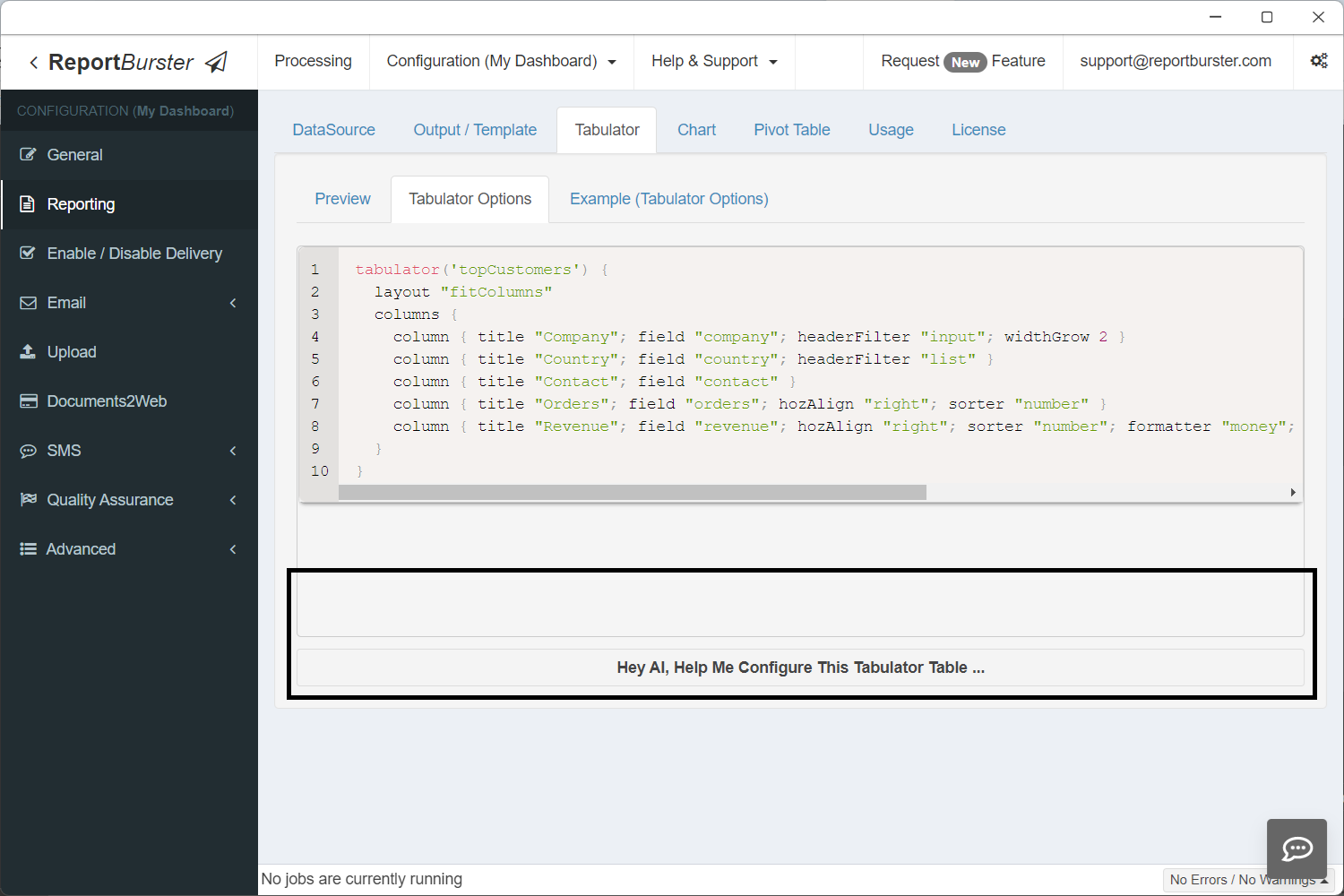
tabulator('topCustomers') {
  layout "fitColumns"
  columns {
    column { title "Company"; field "company"; headerFilter "input"; widthGrow 2 }
    column { title "Country"; field "country"; headerFilter "list" }
    column { title "Contact"; field "contact" }
    column { title "Orders"; field "orders"; hozAlign "right"; sorter "number" }
    column { title "Revenue"; field "revenue"; hozAlign "right"; sorter "number"; formatter "money"; formatterParams([thousand: ',', symbol: '$', precision: 2]) }
  }
}'topCustomers' — the same ID used in ctx.reportData('topCustomers', data) in the script and component-id="topCustomers" in the HTML template.
Chart tab:

chart('revenueTrend') {
  type 'line'

  data {
    labelField 'month'

    datasets {
      dataset {
        field 'revenue'
        label 'Revenue'
        backgroundColor 'rgba(15, 118, 110, 0.1)'
        borderColor '#0f766e'
        borderWidth 2
        fill true
        tension 0.3
        pointRadius 3
        pointBackgroundColor '#0f766e'
      }
    }
  }

  options {
    plugins {
      legend { display false }
    }
    scales {
      y {
        beginAtZero true
        title { display true; text 'Revenue ($)' }
      }
      x {
        title { display true; text 'Month' }
      }
    }
  }
}
chart('revenueByCategory') {
  type 'doughnut'

  data {
    labelField 'category'

    datasets {
      dataset {
        field 'revenue'
        label 'Revenue'
        backgroundColor(['#0f766e', '#e15759', '#4e79a7', '#f28e2b', '#76b7b2', '#59a14f', '#edc949', '#af7aa1'])
        borderColor '#ffffff'
        borderWidth 2
      }
    }
  }

  options {
    plugins {
      legend { position 'right' }
    }
  }
}'revenueTrend' and 'revenueByCategory' — the same IDs used in ctx.reportData('revenueTrend', data) / ctx.reportData('revenueByCategory', data) in the script and component-id="revenueTrend" / component-id="revenueByCategory" in the HTML template.
Pivot Table tab:
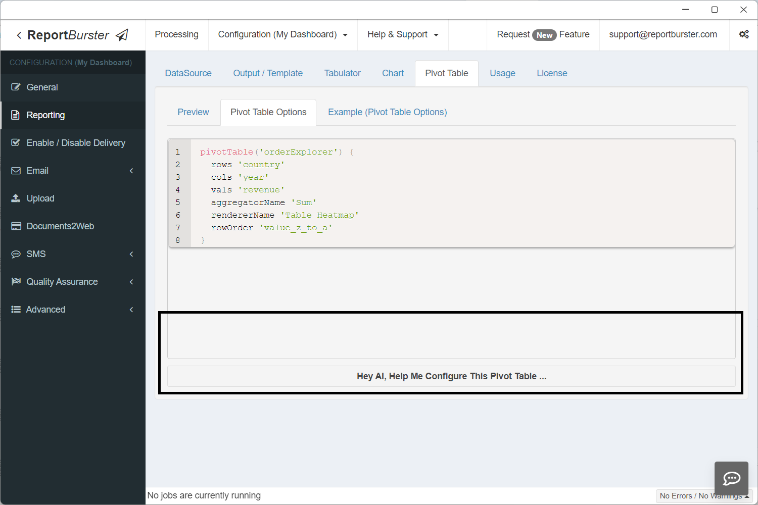
pivotTable('orderExplorer') {
  rows 'country'
  cols 'year'
  vals 'revenue'
  aggregatorName 'Sum'
  rendererName 'Table Heatmap'
  rowOrder 'value_z_to_a'
}'orderExplorer' — the same ID used in ctx.reportData('orderExplorer', data) in the script and component-id="orderExplorer" in the HTML template.
Step 7: View Your Dashboard
Step 8: Share Your Dashboard
All dashboards created with ReportBurster are embeddable — go to the Usage tab to find how.
ReportBurster dashboards can be embedded in any external web application using the <rb-dashboard> web component.
The exact syntax is shown in the screenshot below.
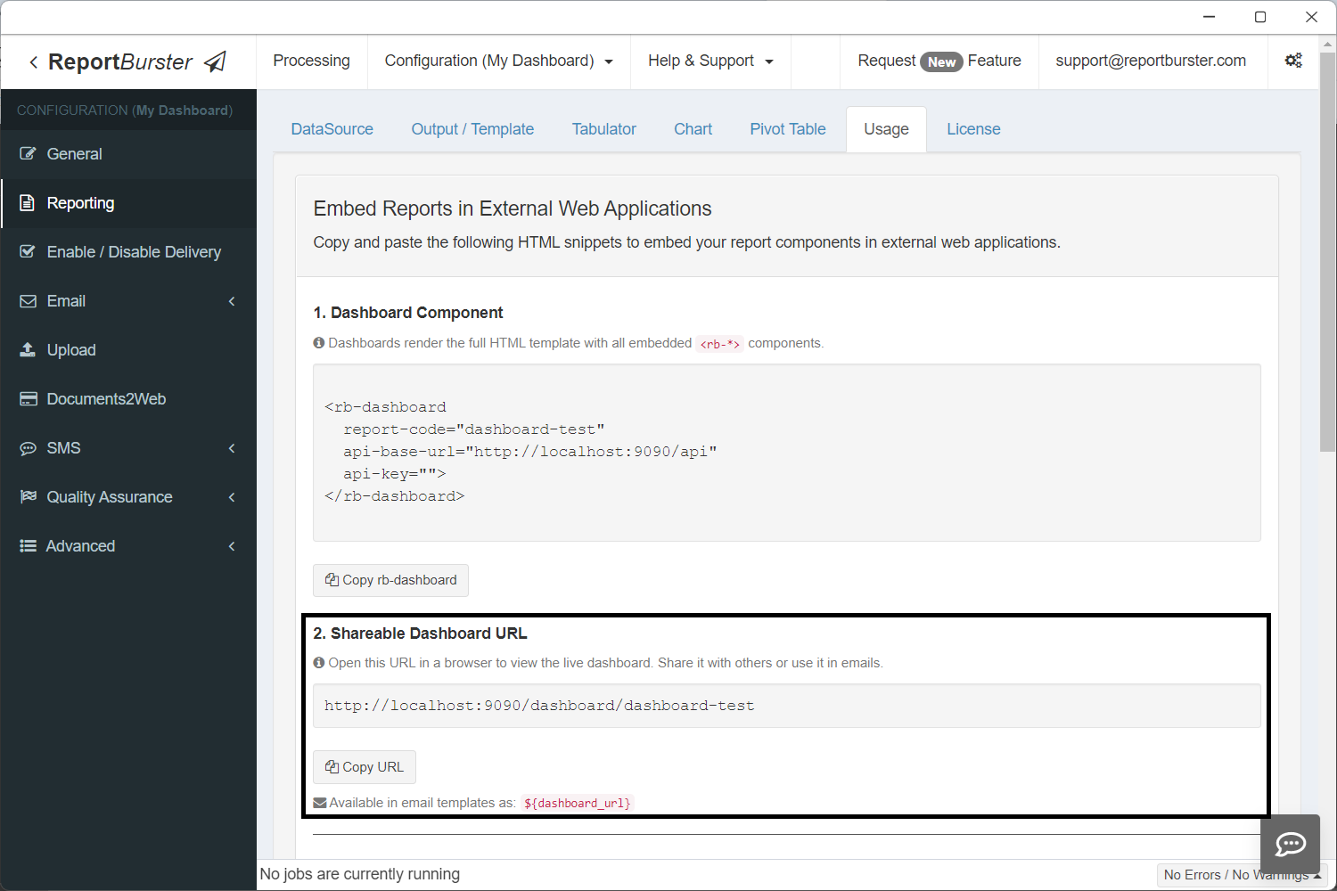
In addition, every dashboard gets a shareable URL automatically.
The dashboard URL is also available as the built-in variable ${dashboard_url} in email templates. Combined with ReportBurster's scheduling capabilities, you can set up automated emails that send dashboard links to stakeholders on a recurring schedule — daily, weekly, monthly, or any custom interval. Recipients click the link and see the live, always-up-to-date dashboard.
The Building Blocks
Every dashboard you build with ReportBurster is assembled from these components:
| Component | What It Does | Dashboard Use |
|---|---|---|
<rb-parameters> | Date pickers, dropdowns, filters | Dashboard-wide filters (date range, department, region) |
<rb-tabulator> | Interactive data grid with sorting, filtering, pagination | Detail tables, transaction lists, drill-down views |
<rb-chart> | Bar, line, pie, area, scatter, and more | Trends, distributions, comparisons |
<rb-pivot-table> | Multi-dimensional drag-and-drop analysis | Revenue breakdowns, cross-tabulations, ad-hoc exploration |
<rb-report> | Complete report viewer combining all of the above | Full self-contained report pages |
<rb-value> | Displays a single scalar value — a number, text, or date that doesn't belong in a table or chart (see Atomic Values below) | Summary cards, totals, counts, averages |
Each component connects to your data through ReportBurster's backend — whether that data lives in a transactional database, DuckDB, or ClickHouse. Mix and match them on a single page to create exactly the dashboard you need.
Atomic Values (rb-value)
The <rb-value> component displays a single value — a revenue total, order count, average, calculated result, or any scalar. The value can come from a database query, a computation in your script, or any other source. It renders as a plain inline <span> with no table or chart overhead.
Attributes
| Attribute | Required | Description |
|---|---|---|
report-code | Yes | Report folder name |
api-base-url | Yes | Base URL for API |
component-id | Yes | Matches ctx.reportData('id', data) in the Groovy script |
field | Yes | Column name from the query result to display |
format | No | currency ($58,153), number (1,234), percent (73%), date (Mar 15, 2024), or omit for raw value |
Multiple Values with Shared Fetch
Multiple <rb-value> elements with the same component-id make one HTTP request — the result is cached client-side and each element picks its column via field:
<!-- 1 SQL query, 1 HTTP request, 4 value cards -->
<div class="value-card">
  <span class="label">Revenue</span>
  <rb-value report-code="dashboard" api-base-url="http://localhost:9090/api/jobman/reporting"
            component-id="atomicValues" field="revenue" format="currency"></rb-value>
</div>
<div class="value-card">
  <span class="label">Orders</span>
  <rb-value report-code="dashboard" api-base-url="http://localhost:9090/api/jobman/reporting"
            component-id="atomicValues" field="orders" format="number"></rb-value>
</div>
<div class="value-card">
  <span class="label">Avg Order Value</span>
  <rb-value report-code="dashboard" api-base-url="http://localhost:9090/api/jobman/reporting"
            component-id="atomicValues" field="avgOrderValue" format="currency"></rb-value>
</div>
<div class="value-card">
  <span class="label">Customers</span>
  <rb-value report-code="dashboard" api-base-url="http://localhost:9090/api/jobman/reporting"
            component-id="atomicValues" field="customers" format="number"></rb-value>
</div>Groovy Script
Return all values as columns in a single row. No extra configuration is needed.
if (!componentId || componentId == 'atomicValues') {
    def data = dbSql.rows("""
        SELECT
            ROUND(SUM(od.UnitPrice * od.Quantity), 0) AS revenue,
            COUNT(DISTINCT o.OrderID) AS orders,
            ROUND(SUM(od.UnitPrice * od.Quantity) / COUNT(DISTINCT o.OrderID), 0) AS avgOrderValue,
            COUNT(DISTINCT o.CustomerID) AS customers
        FROM Orders o
        JOIN "Order Details" od ON o.OrderID = od.OrderID
    """)
    ctx.reportData('atomicValues', data)
}The column aliases (revenue, orders, avgOrderValue, customers) match the field attributes on the HTML elements.
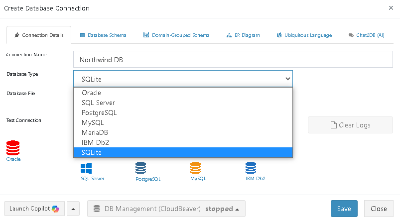
Supported Databases
Next: Make It Fast
Your dashboard is designed and assembled. Now make it performant. The Performance & Real-Time guide covers the implementation details — multi-component report configuration, efficient data loading with componentId, Redis caching for expensive queries, and real-time data patterns.