ReportBurster v14: Go Deeper With Embeddable Analytics & OLAP
Virgil
With each major release we like to pick one area of the platform, go deep, and make it significantly better. With v14 we chose Embeddable Analytics & OLAP — the data-driven web components you drop into dashboards and web apps: datatables, charts, and pivot tables.
The result: a much larger example library, a Redis caching layer for faster dashboards, and performance work that keeps the browser responsive even against million-row datasets.
Extensive Examples for Tables, Charts, and Pivot Tables
Good data-driven components are only useful if you know what they can do. v14 ships with a large library of live, copy-paste-ready examples across all three component families:
-
Data Tables — Layout modes (virtual DOM, fit-to-data, fit-to-width), interaction patterns (sorting, filtering, pagination, editing), and advanced scenarios (grouped rows, column calculations, tree data, spreadsheets).
-
Charts — Line, bar, grouped bar, stacked bar, pie, doughnut, dual-axis mixed, area, radar, scatter, bubble, waterfall, funnel, heatmap, treemap, gauge, and candlestick — each with realistic business data and configuration you can copy straight into your project.
-
Pivot Tables — Fundamentals (sum, cross-tab, multi-dimension), filtering and sorting, every renderer (table, heatmap, bar chart, line chart, area chart, scatter), all aggregators, and advanced features like derived attributes and subtotals.
Every example includes a Configuration toggle so you can inspect and copy the exact Configuration that drives it. Browse, pick, paste, done.
Loading…
Loading…
Build Your Own Dashboards
The pieces are all there: a data warehouse (DuckDB for in-process analytics, ClickHouse when you outgrow it), data-driven web components for tables, charts, pivot tables, and parameterized filters — each embeddable in any web page.
You think putting it all together into a dashboard would be difficult? Not at all — just ask Athena.
Have a conversation with her — tell her what you're thinking, what you'd need, who the audience is. For instance: "Design a BI dashboard for our CFO — which KPIs should it include?" She considers the audience, the decisions they face, and the metrics that actually drive those decisions. Then she generates a complete mockup — layout, chart types, data tables — ready to review.
Iterate from there. Swap a metric, rearrange panels, add a date range filter. Each turn sharpens the result. When you're happy with the design, connect it to your real data with ReportBurster's web components — or let Athena handle the wiring too.
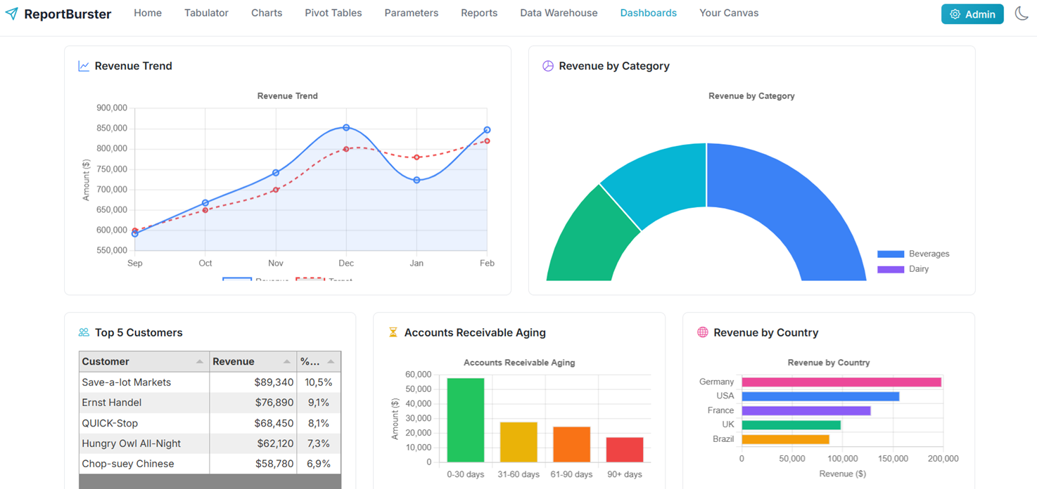
Here is the CFO dashboard she produced over the Northwind sample data warehouse — revenue trends, profit margins, AR aging, top customers, geographic distribution — from a single prompt:
Key CFO KPIs in this dashboard:
- Financial Health — Total Revenue ($847K) + growth trend, Gross Profit ($292K) + margin (34.5%), Outstanding AR ($128K)
- Operational Performance — Total Orders (1,247), avg. $680/order, Days Sales Outstanding (28 days, below 30-day target)
- Customer & Product Insights — Top Customer: Save-a-lot Markets ($89K), Top Product: Côte de Blaye, Top Region: Germany (23.4%)
- Risk Management — AR Aging buckets ($42K at risk in 60+ days), Revenue by Country (geographic concentration)
The dashboard uses a dark theme with glassmorphism effects — professional, modern, and data-dense for executive decision-making.
Ready for more tests!
Athena is part of the ReportBurster AI Crew introduced in v13 — domain-expert AI agents that learn your projects and get sharper with every conversation. See the full walkthrough in the Dashboards documentation.
Redis Starter Pack — Your Dashboards Are About to Get Faster
v14 adds a Redis Starter Pack — launch it from the Starter Packs UI and your data-driven components start serving cached results in milliseconds instead of hitting the database on every page load.
The first request queries the database and populates the cache; every subsequent request is served from memory until the TTL expires. For dashboards with many concurrent viewers or expensive aggregation queries, the speed-up is immediate and significant.
Next: Make It Even Faster
Once your dashboard is running, the Performance & Real-Time guide walks you through the next level: bundling multiple visualizations into a single multi-component report, loading only the data each component needs via componentId, setting up Redis caching and TTLs, and pushing live updates with Redis Pub/Sub.
Try v14
Download ReportBurster and have it running in five minutes:
- QuickStart Guide — zero to first report
- Data Tables — interactive grids, every layout and feature
- Charts — every chart type, ready to embed
- Pivot Tables — cross-tabs, heatmaps, and OLAP analysis
Need help getting started? We offer complimentary setup assistance — contact us for a guided walkthrough.